Understanding the Ideal Process for Designing 3-Inch Round Labels

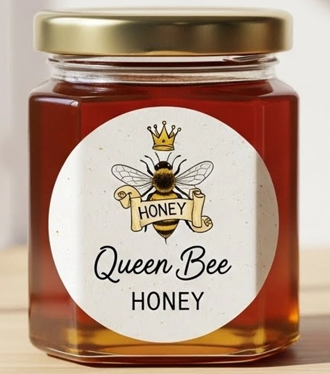
A 3-inch round label is often the perfect size for showcasing your brand, product details, and key selling points. However, choosing the right size is only half the job—the real impact comes from an effective label design. A well-designed round label can instantly grab attention and influence purchasing decisions.
TL;DR: Key Tips for Designing 3-Inch Round Labels
- Limit your colour palette to two or three colours.
- Keep the design clean, balanced, and uncluttered.
- Use simple, bold fonts for readability.
- Make your logo placement a top priority.
- Add contact details only if space allows.
- Combine fonts carefully, ensuring they complement each other.
3-inch round sticker labels have remained popular for years because they offer enough space to display essential information without overwhelming the design. But how do you make sure your label looks professional and effective? Let’s break it down.


Choosing the Right Design Elements
How Many Colours Should You Use?
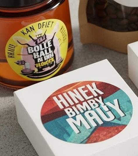
When designing a 3-inch round label, stick to two or three colours. Using too many colours can make the label appear busy and difficult to read. Choose one dominant colour to reflect your brand identity and support it with one or two complementary shades to maintain visual harmony.
Creating a Balanced Label Design
Balance is essential when working with round labels. Overloading the design with graphics, text, or decorative elements can distract from key information. Focus on minimalism—highlight only what matters most, such as the product name, logo, and a short USP. A clean layout ensures your message is clear and easy to absorb.
Selecting the Right Fonts
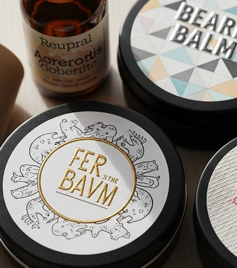
Fonts play a crucial role in round label readability. Because of the curved shape, overly decorative or thin fonts can become difficult to read. Choose simple, bold, and legible fonts that maintain clarity even at smaller sizes. Keeping font usage consistent across the design helps create a polished and professional look.
Focusing on Branding Elements
Why Logo Placement Matters
Your logo is one of the most important elements of your round label. It should be clearly visible and positioned thoughtfully—often in the centre or top portion of the label. Avoid adding too many small details around the logo, as they can reduce its impact and clarity.
Including Contact and Social Information
If space permits, you can include your website, social media handles, or contact details on your round label. These elements help customers connect with your brand after purchase. However, if the label feels crowded, prioritise the most important information to maintain a clean design.
Can You Use Multiple Fonts?
Yes, using more than one font is acceptable, as long as they share a similar style and complement each other. Avoid mixing fonts that clash or using a different font for every line. Subtle variation adds interest, while consistency maintains elegance.

Final Thoughts
Designing an effective 3-inch round label is all about simplicity, balance, and clear branding. With the right colour palette, thoughtful layout, and readable typography, your round labels can enhance your product’s appeal and strengthen brand recognition.
If you’re looking to purchase high-quality circle stickers, explore the extensive range available at AA Labels. You’ll find reliable materials, professional finishes, and sizes that suit every requirement.
For more details, visit https://www.aalabels.com/
Posted in: Customer Case Study
If you would like to find out more about our cost-effective, short-run labelling and packaging options, for personalisation and promotion. Please contact our customer care team, who will be happy to discuss your requirements and provide advice on the options available.


